Bank of Ireland
Bank of Ireland
Bank of Ireland
Role
Senior UI Designer
Agency
BIO [Contract]
Duration
November 2021 → July 2022
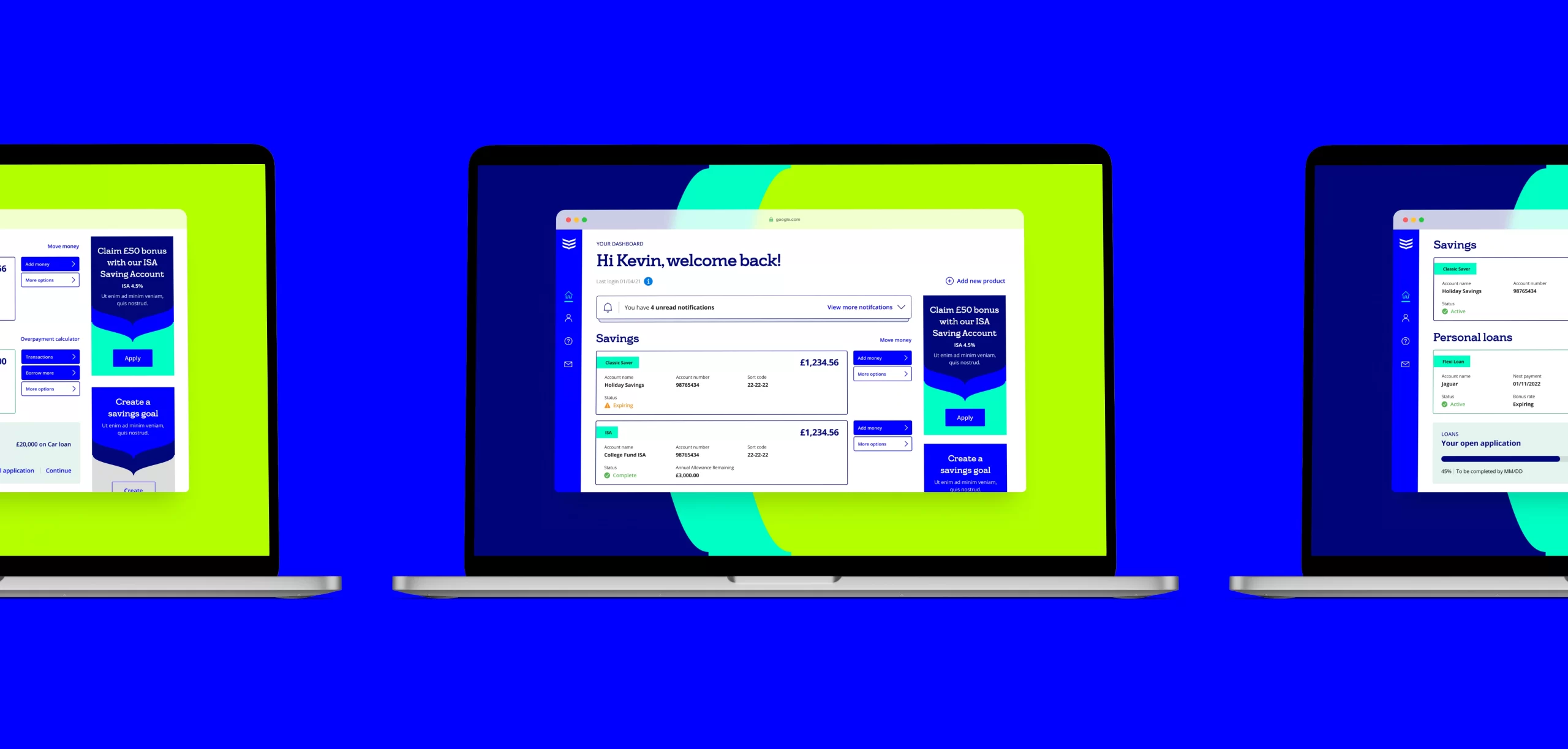
As Bank of Ireland expanded their market presence into the UK, they recognised the importance of providing a user-friendly web experience. To achieve this, they collaborated with BIO, a leading digital agency, to revamp their digital existence.
Responsive Web Design
Interface Design
Web Application
Mobile Design
Design System
B2C
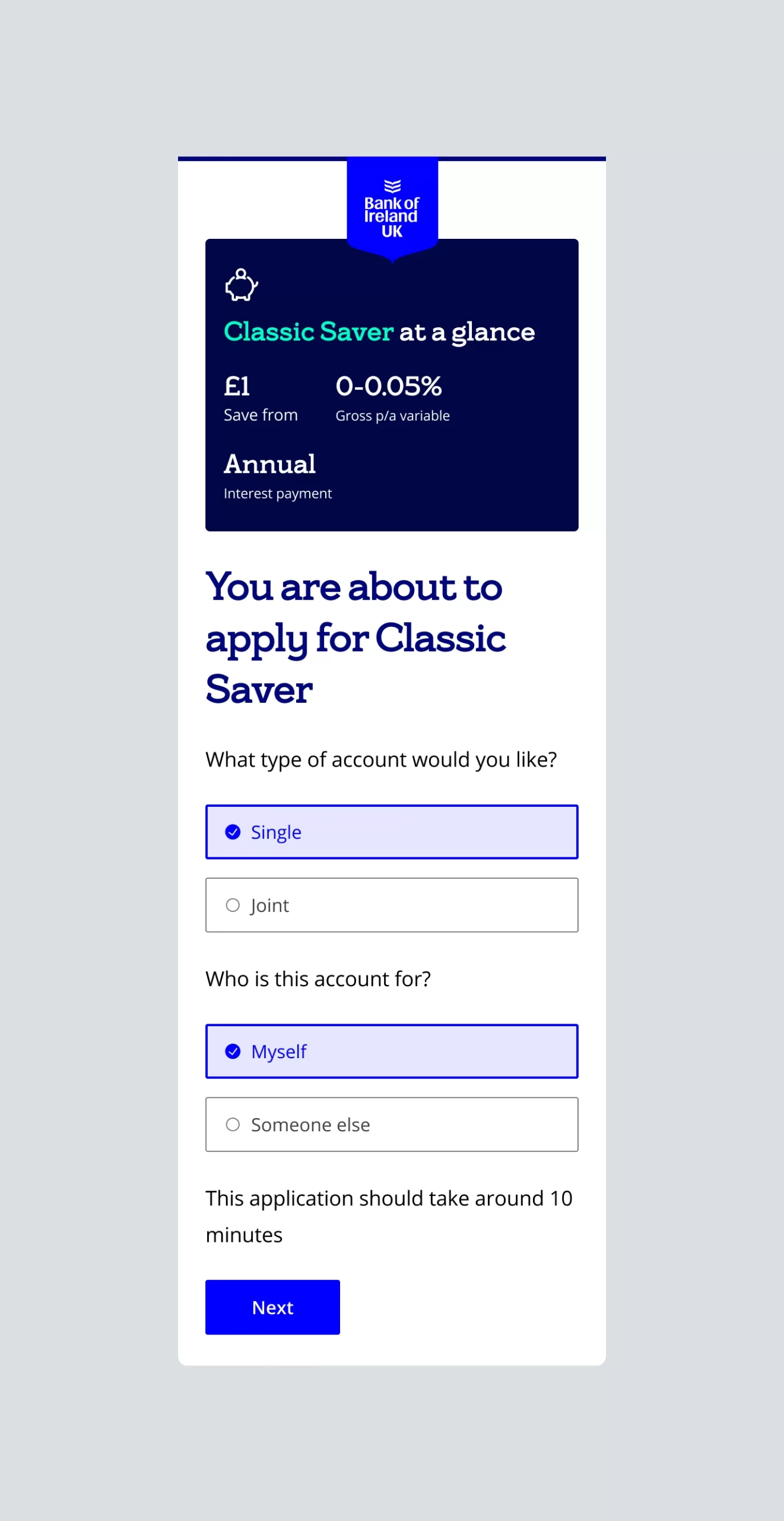
Entering the 'Originations' flow on mobile
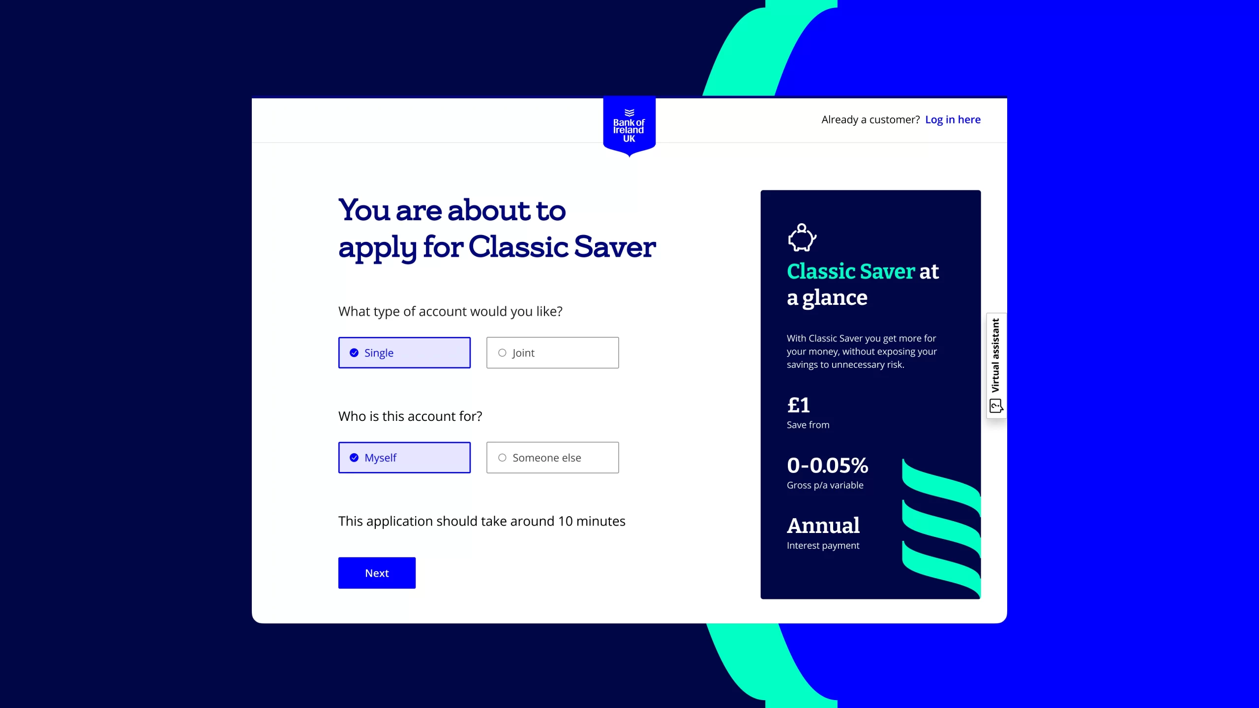
Entering the 'Originations' flow on desktop
The new digital experience supported both origination [applying for a service] and in-life management [using the service] for existing and new products, aiming to acquire new clients.
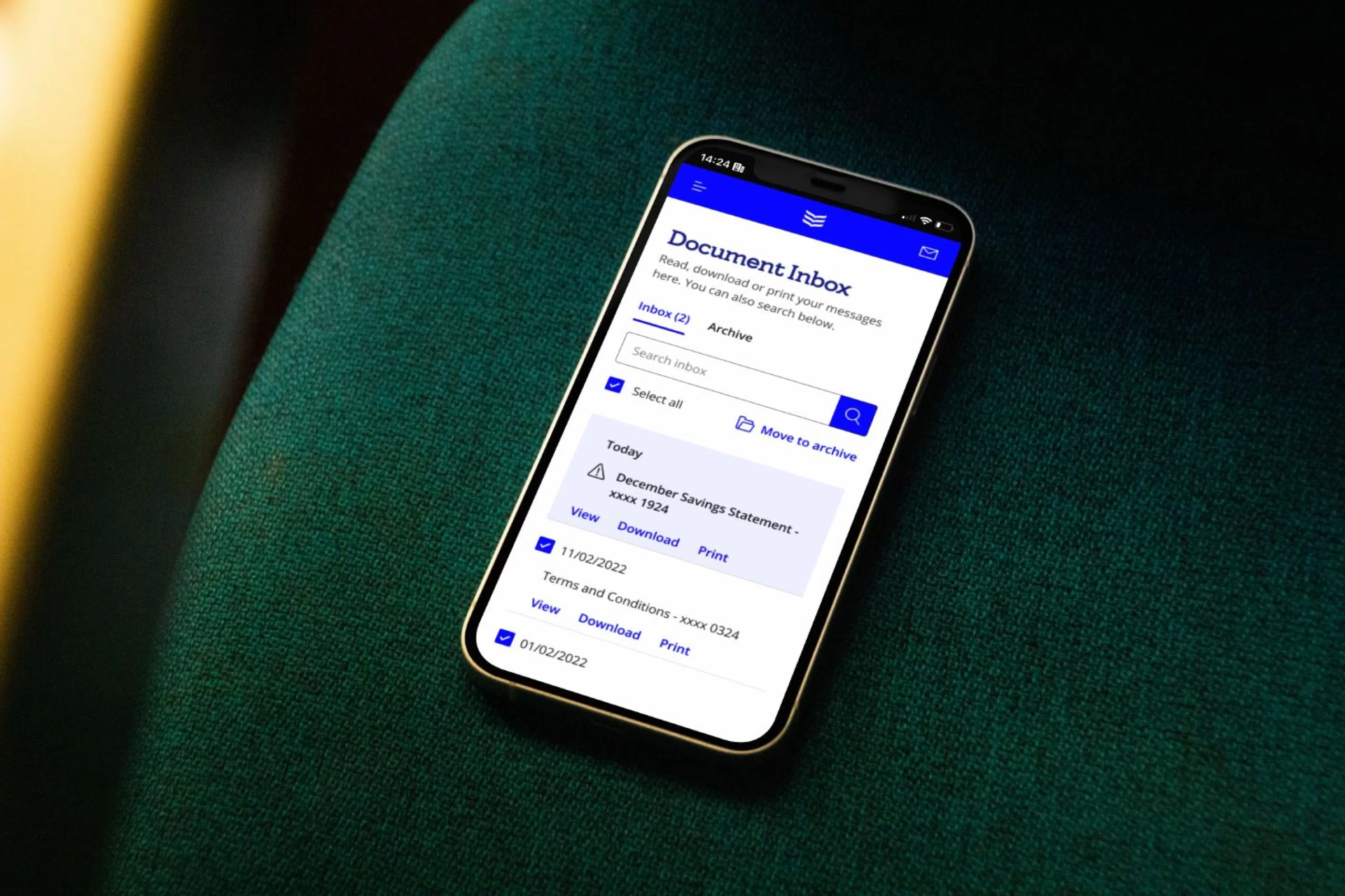
Introduction of the 'Document Inbox', for easy access to all communications from the bank.
During the discovery phase, the CX team collaborated with business analysts to understand project requirements and user needs. When I joined the team as a Senior UI Designer, my team was responsible for creating UI patterns and components, incorporating wireframes handed from the CX team and in line with the Bank of Ireland branding.
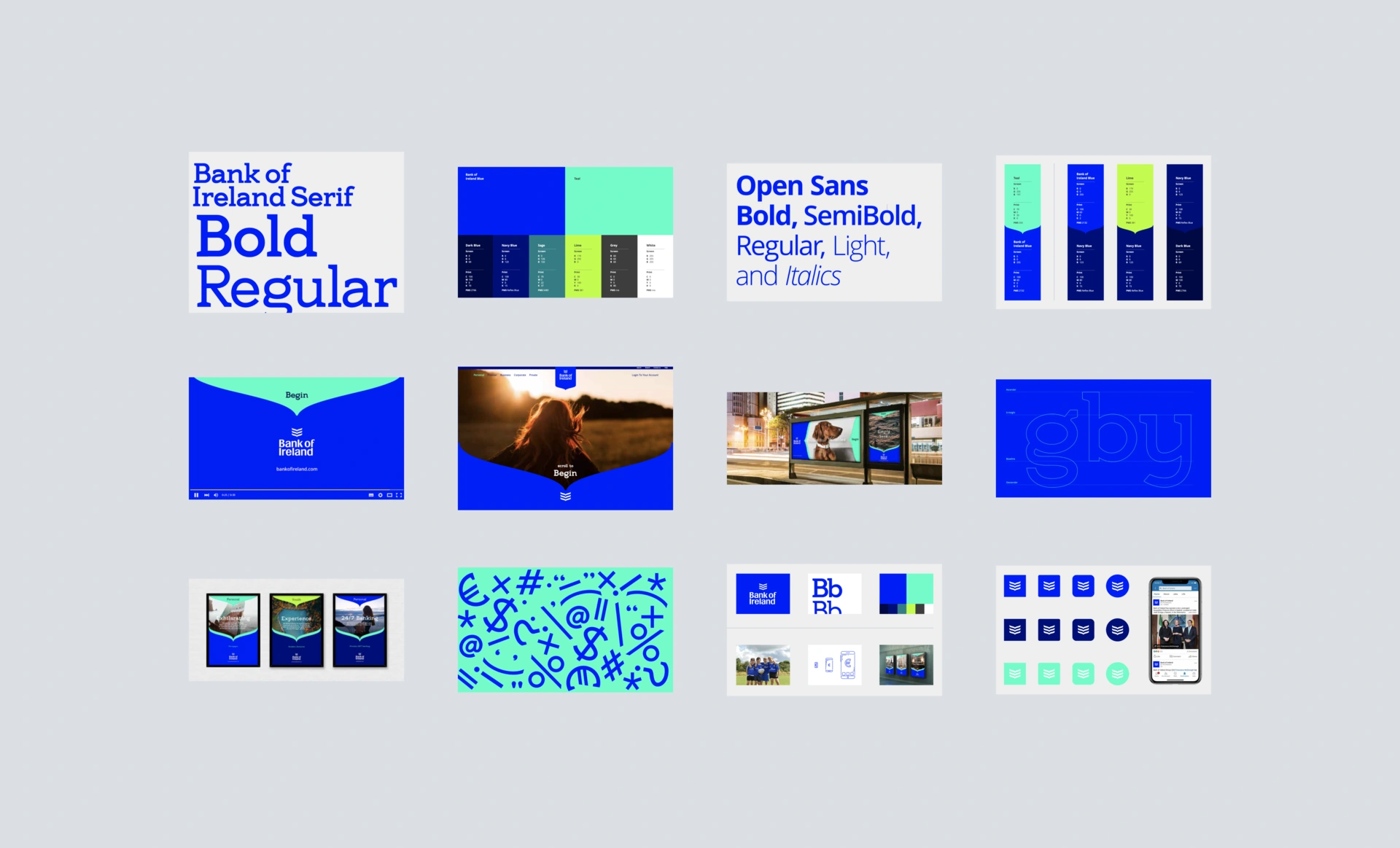
Bank of Ireland branding and elements
My team also provided detailed design annotations and developed corresponding prototypes, ensuring seamless integration of design elements and interactions into the build.
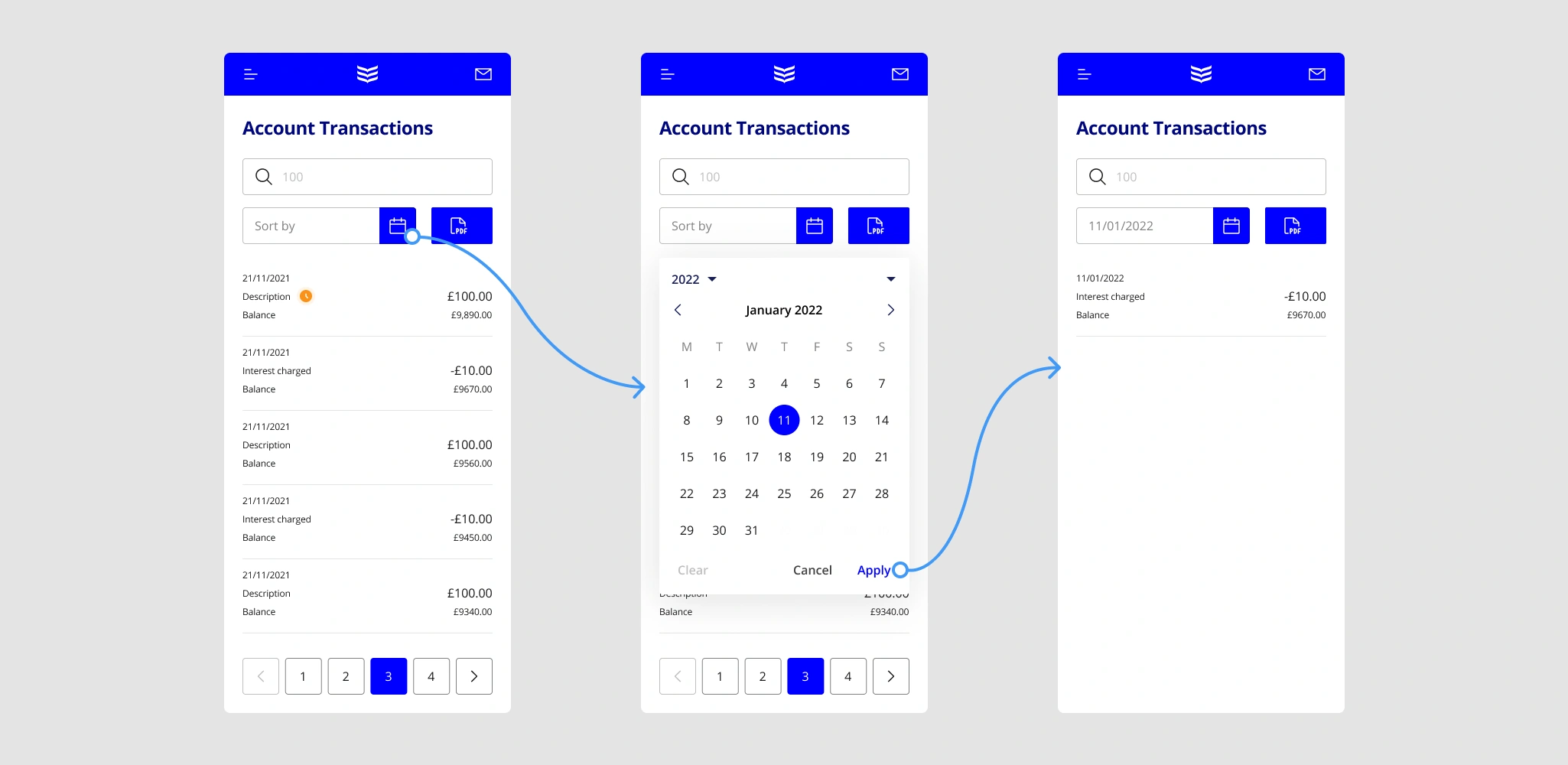
Date picker inside 'Manage Account'
Once the flows are created, new components were added to the design system. Another effort was on white-labeling these components, as the new products would also be offered by the AA and Post Office in the UK.
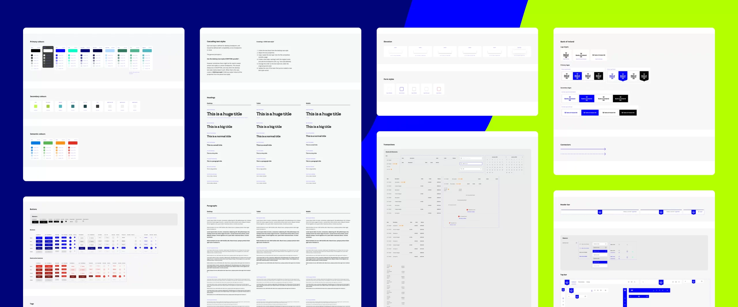
The design system for BoI
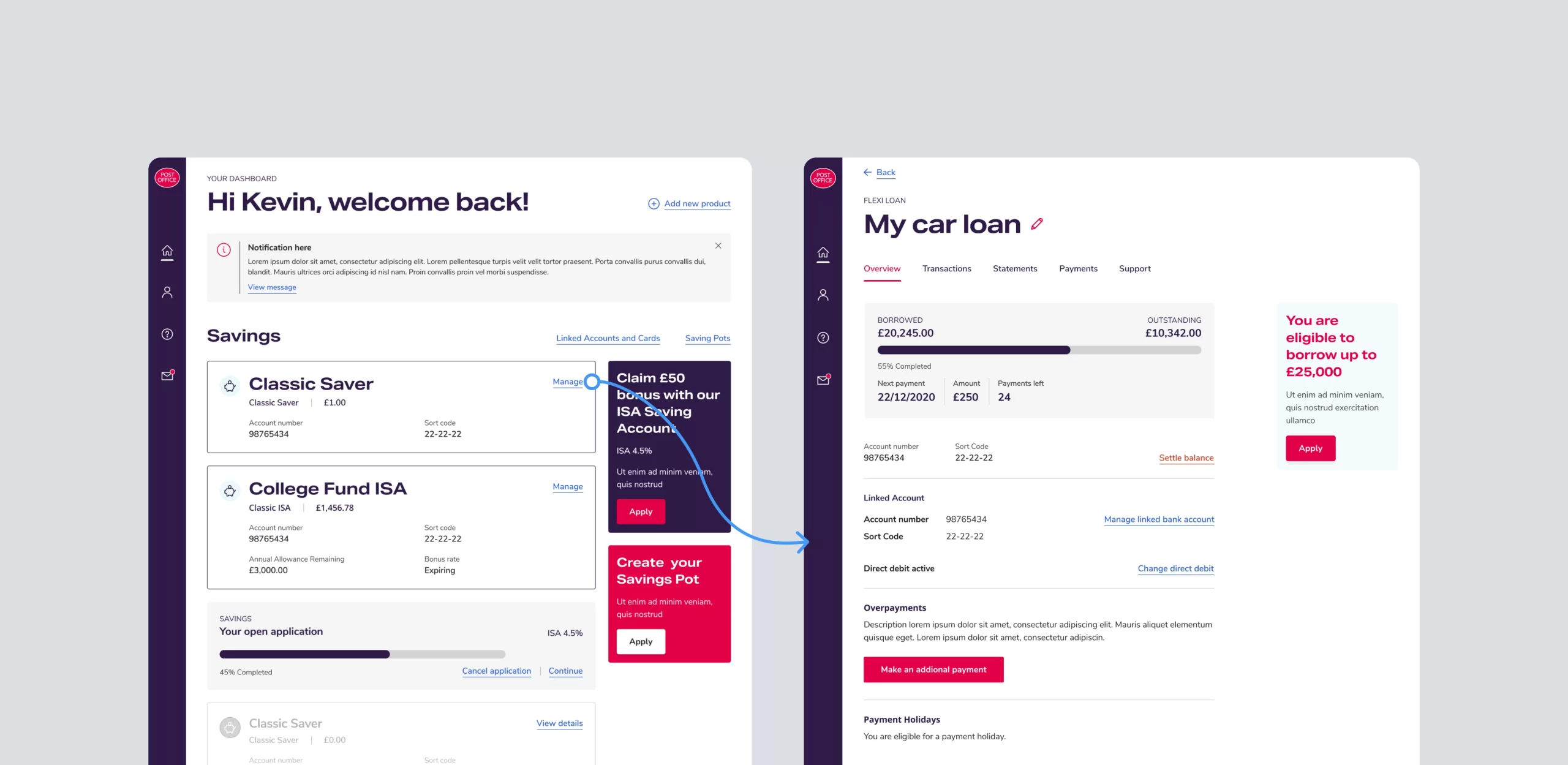
The 'Customer Hub' design for Post Office
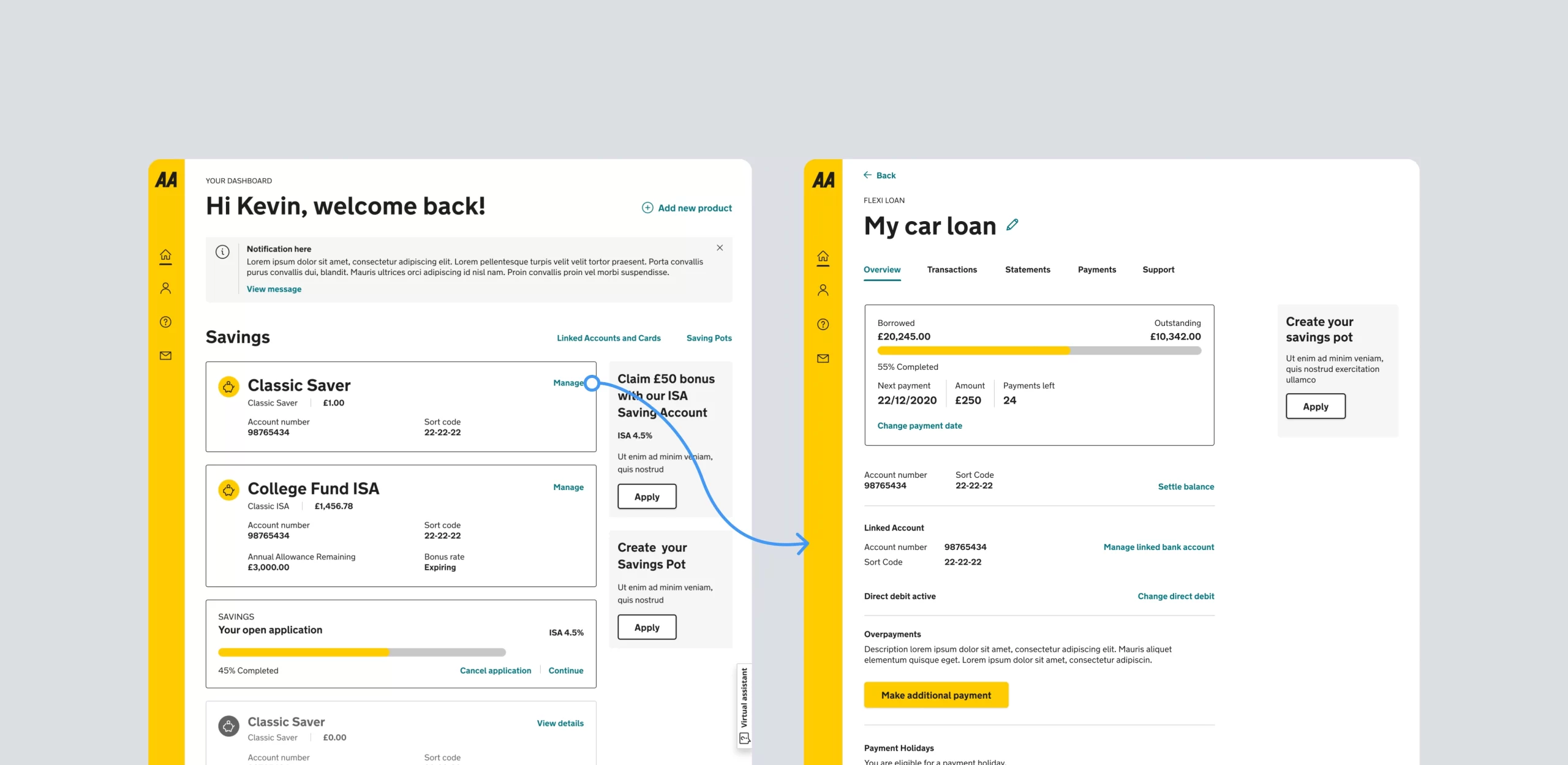
The 'Customer Hub' design for AA
Customers aged 60 and above primarily conducted their banking through branches or call centers, resulting in long queues and delays. To minimise dissatisfaction, my team introduced large font sizes, clear icons, easy-to-read text and a high-contrast colour scheme, which meant improved accessibility for older adults.
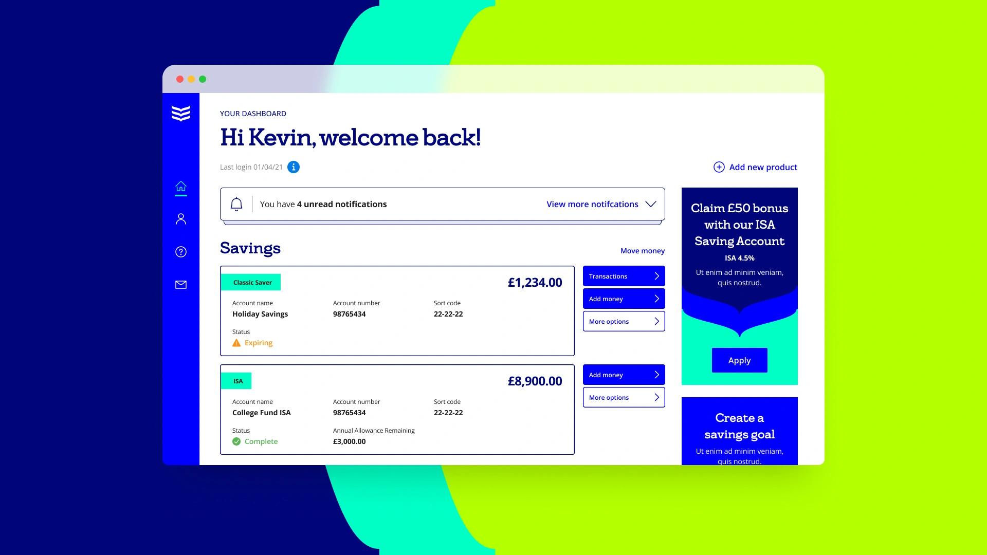
The 'Customer Hub' for the in-line management of savings and loans accounts
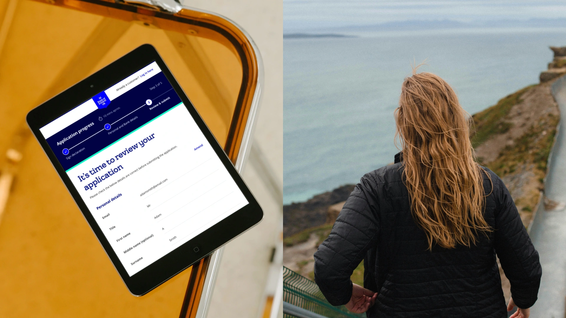
Implementation of progress steppers prompted customers to complete tasks, while managing expectations and improving conversion rates. The steppers also served as a tool for tracking user behavior and identifying potential pain points in the process.
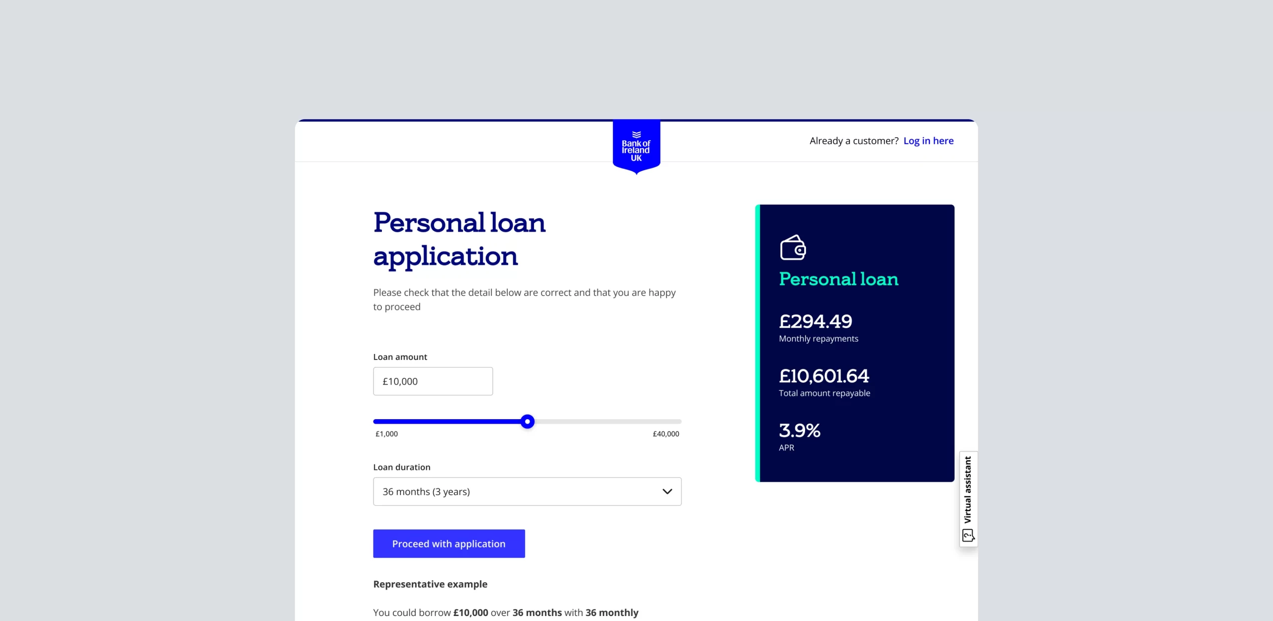
'Origination' flow for personal loans
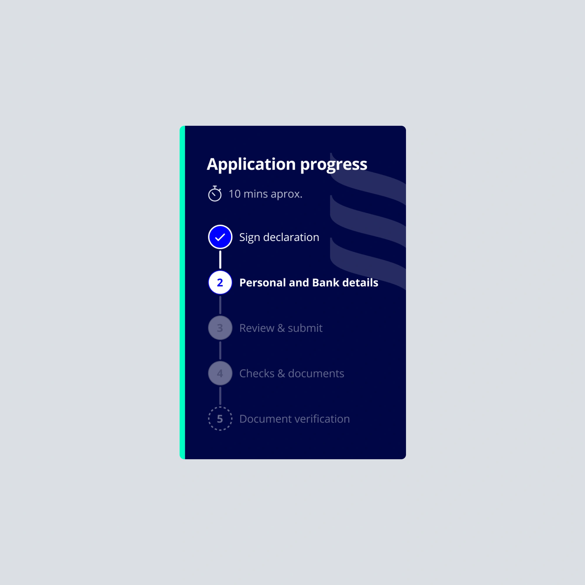
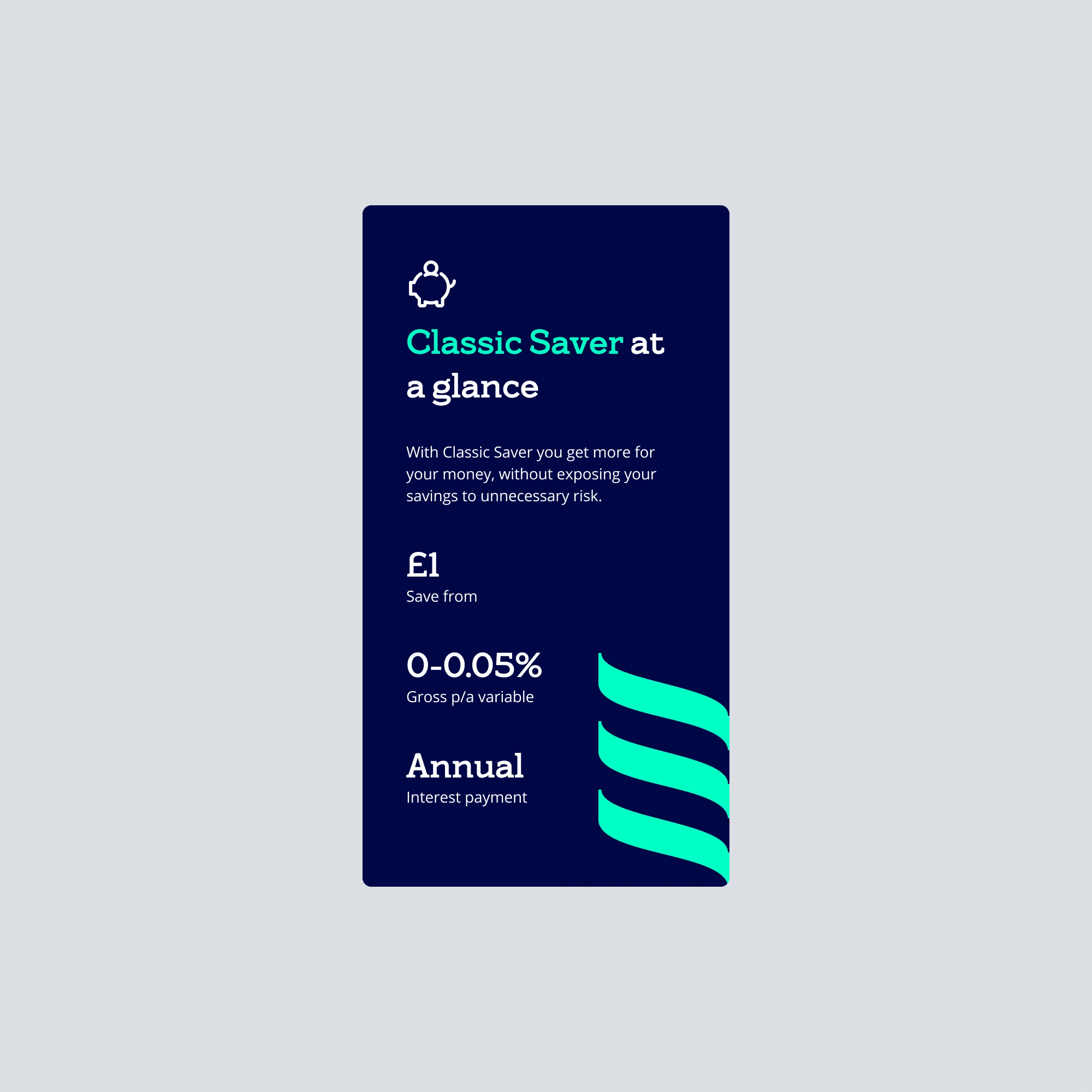
Progres tracker and product summary components
Personalised ads and instant notifications inside the hub enhanced the user experience, while dedicated spaces for different products brought clarity to single actions.
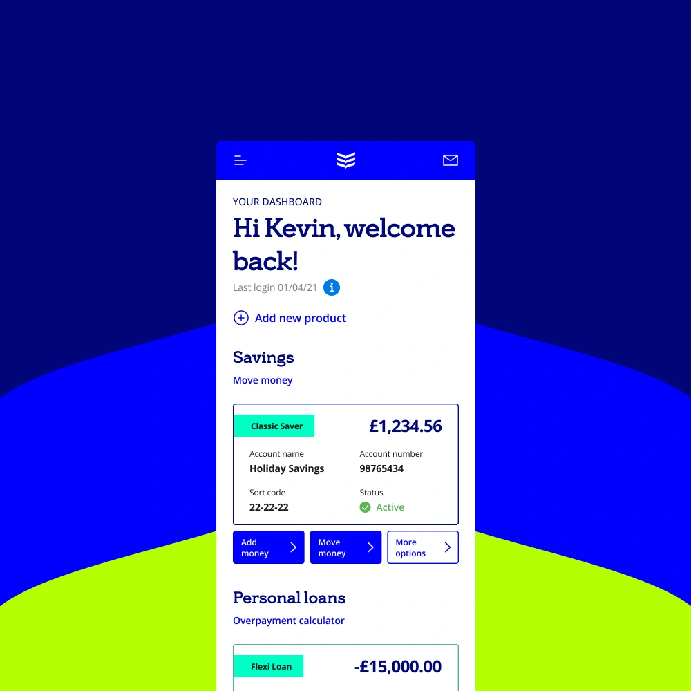
The 'Customer Hub' on mobile
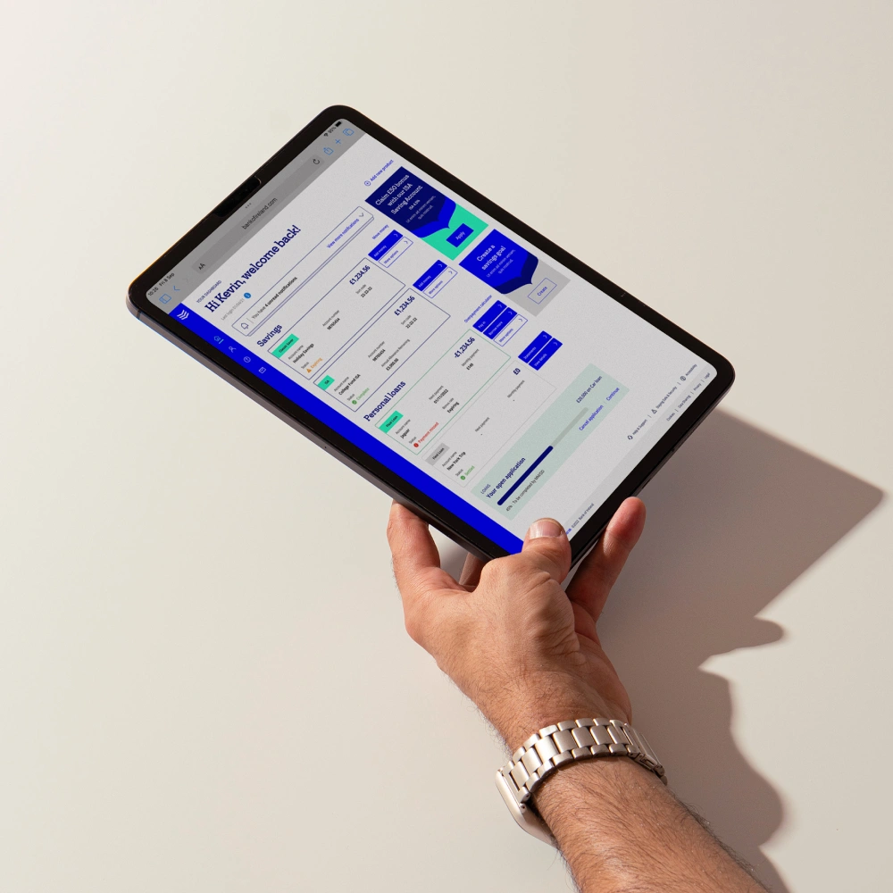
The 'Customer Hub' on tablet
Ayşe D. Aba
Product designer from London.
© 2024
